
1-click AWS Deployment 1-click Azure Deployment
Overview
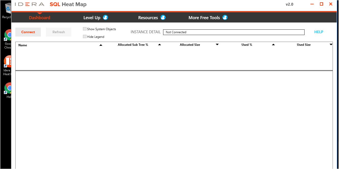
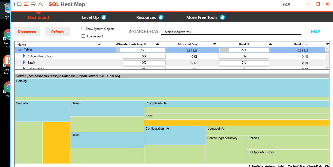
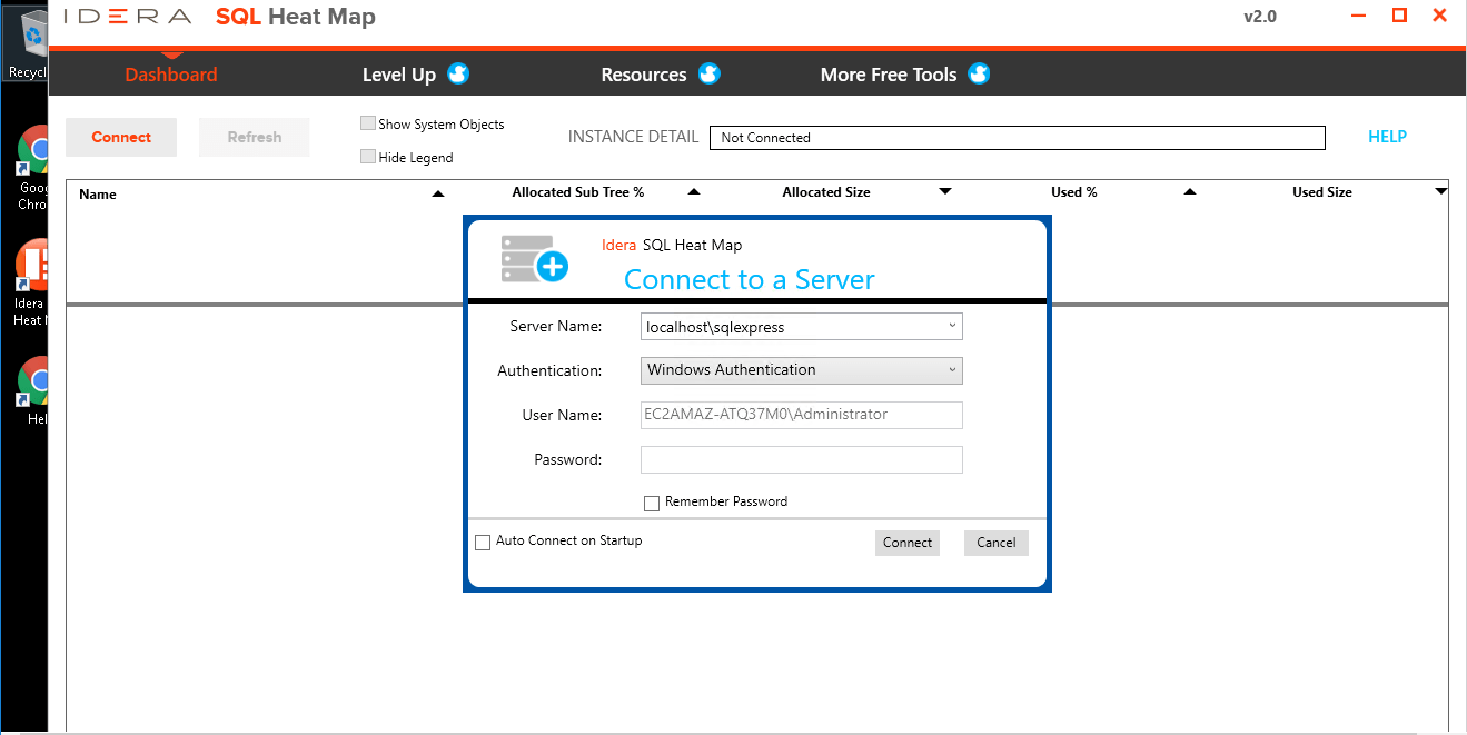
SQL Heat Map is a tool for easy-to-read analytical imaging to rapidly identify your largest capacity of users.
- Get one visual view of storage in all tables of a database
- See storage allocation, utilization, and type of data
- Great for capacity reviews and planning
- Quickly locate tables and indexes that need more allocated storage
A heat map is a type of data visualization which uses a matrix of colored cells to represent the value or intensity of individual data points as well as relationships and trends within a data set. Heat maps are often applied to locational or geographical data, perhaps as a colored overlay on a map of a city. However, heat maps are not necessarily spatial, and the rows and columns of the matrix may represent other variables. For example, a heat map could be designed to visualize weather data in a calendar format. In addition to the arrangement of cells in the matrix, a heat map uses color (typically a gradient) to indicate the values associated with each cell. In the case of the weather calendar example, a gradient from red to blue could be chosen to plot the temperature recorded on each day. The combination of a range of colors and the relative locations of cells in the matrix allows viewers to draw conclusions about the data set as a whole as well as localized conditions and variable intensities. A series of weather calendars for a number of locations would not only tell you how cold it is in New York City in February, but also the relative intensity and length of winters in, say, Miami, Manila, and Mexico City.
If our server is down, we want to know right away, but if everything is smooth we do not want to keep on getting reminders about that. For that reason Heatmap is a very essential part of Spotlight on SQL Server Freemium. It gives an ‘at-a-glance’ picture of the state of all the servers DBAs have in their environment. Colors communicate all the information about what is going on with your server. The heatmap takes this a step further by displaying each server as a tile and then aggregating all of the statuses of a server and assigning a size to that tile. It also displays alarms for the connection when touched.

History
“The term Heatmap was originally coined and trademarked by software designer Cormac Kinney in 1991, to describe a 2D display depicting real time financial market information.
Heat maps originated in 2D displays of the values in a data matrix. Larger values were represented by small dark gray or black squares (pixels) and smaller values by lighter squares. Sneath (1957) displayed the results of a cluster analysis by permuting the rows and the columns of a matrix to place similar values near each other according to the clustering. Jacques Bertin used a similar representation to display data that conformed to a Guttman scale. The idea for joining cluster trees to the rows and columns of the data matrix originated with Robert Ling in 1973. Ling used overstruck printer characters to represent different shades of gray, one character-width per pixel. Leland Wilkinson developed the first computer program in 1994 (SYSTAT) to produce cluster heat maps with high-resolution color graphics. The Eisen et al. display shown in the figure is a replication of the earlier SYSTAT design.”
Appropriate Data Types
Heat maps are particularly effective when visualizing data that has a spatial element (although this is not necessary) due to the ease of understanding relationships between relative locations in space. Time can be another interesting set of coordinates, as in the weather calendar example. Heat maps also work well with data which has a range of values or intensities, which lends itself to a gradient color scheme. Typically it is best to limit the number of colors, to maintain legibility and not produce misleading visualizations. This can be accomplished by using one color, with a range of intensities, or a bi-polar scheme, blending to a neutral color in the middle. Due to the limitations of additional colors, heat maps are less effective for categorized data. Frequently data scientists will use a rainbow colow scheme, which can work as long as the data is sufficiently distributed across the spectrum. However, many visualizations which default to a rainbow color scheme would arguably be more effective with a simple gradient between two colors.
Methodology
To build a heat map, one must first understand how the data is distributed, whether there is a spatial or temporal structure which will map onto a matrix or some other representational format. Typically each cell in the map corresponds to a single data point. Then, determine the range of values across the data set, and if there is a normal or linear distribution of values, which might lend itself to a gradient with one or two colors. Choose an appropriate color scheme for the data and what it represents. For example, if one were designing a literal heat map, like the weather calendar, it would make sense to choose a red and blue color scheme, with darker reds around 100 degrees F and deeper blues below freezing. Finally, be sure to provide a legend or key to explain how the heat map is intended to be read!
There are a variety of softwares and tools that allow one to make a heat map. Most GIS softwares have tools for making geographical heat maps, as do some CAD softwares. There are also many data visualization softwares which provide an interface for working with data, and most make it pretty easy to produce a heat map. Tableau is one very popular example of such a tool, and they even have a tutorial on making calendar heat maps. However, it is also possible to make heat maps in Excel, and of course there are plenty of JavaScript libraries as well.
How to create a heat map graph in SQL Server Reporting Services 2016
SQL Server 2016 Preview
As mentioned earlier, at the time of writing SQL Server 2016 is still in preview (currently CTP 2.2 has been released). This means that the look and feel of Reporting Services and its charts can still change and that functionality might change, disappear or be added.
Another issue is there is for the moment not yet a new version of SSDT-BI (the Visual Studio shell for developing business intelligence solutions) released for SQL Server 2016. You can develop BI solutions for SQL Server 2016 preview using SSDT-BI 2013 (which is actually for SQL Server 2014), but it has only SQL Server 2014 features. So how are we going to test SSRS functionality now? Luckily Report Builder has already been updated and included in the SQL Server 2016 CTP 2.2 release, so in this tip we’ll use Report Builder to create the heat map.
In order to use Report Builder, you need to install SSRS 2016 CTP 2.2 (or later), preferably not on your production machine. Then you navigate to Report Manager – typically the URL has the format http://myserver/Reports – where you can launch Report Builder.

Creating a heat map in SQL Server Reporting Services
Our starting point is a finished treemap, but without the color saturation. As noted before, you can find a detailed explanation in the tip
Unfortunately, SSRS does not provide an easy way to set the color saturation in the user interface like in Power BI Desktop. This means we have to do it ourselves. We need to specify an expression for the color of the series, which returns a different shade of a color depending on the value of the current measure. This is easily accomplished in Visual Basic .NET and luckily someone has already written the code for us! . The function has the following parameters:
- Value – This is the value of the current measure. In our example, this can be the size in KB of a certain folder or it can be the number of items in that folder.
- MaxPositive – This is the upper limit of values that the measure can take.
- Neutral – This is the lower limit of values that the measure can take.
- ColStr – This is the hexadecimal RGB representation of a color, e.g. #2322EE.
Calling ColorDWB as ColorDWB(MaxPositive,MaxPositive,Neutral,ColStr) will return the full color and ColorDWB(MaxPositive,MaxPositive,Neutral,ColStr) will return the color white. For more info on this function, please refer to the blog post by Jason.
First of all, the code has to be added to Report Builder. Make sure the properties window is visible:
In the Report properties, you can find the Code property:
Clicking the ellipsis will open the Report Properties dialog, where you can enter the code.
The easiest method to calculate the values to pass to the ColorDWB function is to calculate them in the source query of the report. The following query retrieves the maximum number of items found in a folder and it divides the result set in 5 buckets.
SELECT
	 [Year]
	,[Tip]
	,Size			= SUM([Size])
	,NumberOfItems	= COUNT(1)
	,MaxItems		= MAX(COUNT(1)) OVER ()
	,ItemBucket		= CONVERT(INT,NTILE(5) OVER (ORDER BY COUNT(1)) * ((MAX(COUNT(1)) OVER ()) / 5.0))
FROM [dbo].[FileSizes]
GROUP BY [Year],[Tip];
The buckets are calculated using the NTILE window function. The result is multiplied by the maximum found, divided by the number of buckets. This ensures that the value of the bucket is between the range of 1 and the maximum value. In the example here, the maximum number of items is 46. NTILE returns values between 1 and 5. By multiplying with (46/5), we get values between 1 and 46.
The query nests aggregate functions inside window functions. For more information about this behavior, check out Nesting Aggregates with Window Functions.
The next step is to create an expression on the Fill Color property of the series.
The expression takes the following form:
=Code.ColorDWB(Fields!ItemBucket.Value, Fields!MaxItems.Value, 1, "#fd625e")
The treemap is now successfully transformed into a heat map:
In the source query, we used NTILE(5) to divide the sample data into 5 buckets, resulting in 5 different shades in the heat map. This might be a bit too coarse depending on your data distribution, as for example a folder with 19 items is in the same bucket as the folder with 46 items. By playing with the SQL statement, you can work out other algorithms for dividing your data set into different buckets. Simply raising 5 to a higher number will already result in a more fine grained heat map. The highest level of detail can be achieved by replacing NTILE() with ROW_NUMBER() and by taking the amount of rows returned as the maximum value.
SELECT
	 [Year]
	,[Tip]
	,Size			= SUM([Size])
	,NumberOfItems	= COUNT(1)
	,MaxItems		= COUNT(1) OVER ()
	,ItemBucket		= ROW_NUMBER() OVER (ORDER BY COUNT(1))
FROM [dbo].[FileSizes]
GROUP BY [Year],[Tip];
The only downside of creating heat maps in SSRS using the method of this tip is there is no legend detailing the different shades of the color and how they relate to the measure.
Creating a heat map with multiple series groups
As noted before, in Power BI desktop you can for the moment only use color saturation if there is no field on details. In SSRS however, this is possible. Building upon our current example, we can add a series group to the treemap:
But this requires the expression for the color to be adapted. Since there are now multiple series groups with their own color, we cannot just pass one color value to the ColorDWB function. What we need is a color palette, similar to the one you can define on a chart. The MSDN article Specify Consistent Colors across Multiple Shape Charts specifies how you can do this, using again another Visual Basic function: GetColor. Basically the function keeps a list of colors and maps them against values in a hash table. So every time you call the function GetColor(Value), it will assign a color for that value and store it in the hash table. If you call the function again with the same value, you will get the same color in return. If you call the function with a new value, you will get the next color of the list returned.
Using this function, we can adjust the expression:
=Code.ColorDWB(Fields!ItemBucket.Value, Fields!MaxItems.Value, 1, Code.GetColor(Fields!Year.Value))
For every year, a new color is assigned. The resulting heat map:
Create a heatmap in 5 steps with Hotjar
Step 1: get started
Start creating your first heatmap by clicking on the ‘NEW HEATMAP’ button:
Step 2: name your heatmap
Give your heatmap a memorable name (like Homepage, Pricing Page, or Homepage v2 November) so you know exactly what page you are tracking:
Step 3: customize your pageviews
Select how many pageviews you want to capture in your heatmap:
[Note: the number of pageviews you can collect will depend on your plan. With the free plan, you get 1000 pageviews.]
Step 4: select the target page(s)
Choose which page(s) you want the heatmap to capture (don’t know where to put your heatmap? Keep reading to the end of this chapter):
Step 5: set your heatmaps live
Review your configuration, save it, and set your heatmap live:
And that’s it!
What your heat map data will look like
Once your heatmap is live, you need to wait for people to visit your page so Hotjar can start recording their clicking, tapping, swiping, and scrolling behavior.
It only takes one person to visit the page for Hotjar heatmaps to start working—but of course, data based on just one visitor might not be very useful.
As more and more data gets recorded, Hotjar generates the heatmap visualization for the page. From within the interface, you can toggle between the three types of heatmap—click map, move map, and scroll map—and also select the device you’d like to see a heat map report for:
You can also download a spreadsheet with a full breakdown of clicks by HTML element and scroll data from the top to measure your efforts:
In addition to the at-a-glance understanding that you will get from your heatmaps, these rows of data are there to help you design pixel-perfect user experiences; for example, you and your UX design team can easily refer back to the data to find exactly where you need a CTA to capture users’ attention on desktop and mobile.
Best pages to collect heat map data on
Heat maps allow you to take a deeper dive into any of your website pages, but it makes logical sense to start from the ones that are most important to you in terms of traffic, usability, and business objectives.
1. Homepage and landing pages
Your homepage and main landing page(s) are the main entry points into your website. They are often responsible for your visitors’ first impressions and for their decision to continue browsing or abandon the website.
A heatmap on these pages will help you determine how much information gets seen or interacted with, and what elements are being clicked on or ignored.
2. Top pages
Your best-performing pages (the most viewed product page, the most commented blog post, etc.) are obviously doing something right: eye tracking with a heat map can help you understand what is working well, so you can replicate the success elsewhere.
3. Under-performing pages
Your worst-performing pages are as important as the previous ones, but for the opposite reason: there is likely something wrong with them, and placing a heat map there can help you understand what your visitors are (not) seeing or interacting with, so you can take action.
4. New pages
Your newest pages don’t have a lot of data: if you recently added a page to your website, a heat map might be a good way to get some initial information about how the page is performing.
SQL Heat Map on cloud For AWS

Features
Major Features of SQL Heat Map
The benefits of a heat map are very rewarding, let’s say you’re wanting to know which areas of your website are getting the most attention, then a heat map shows you in a visual way that’s easy to understand and then make strategic decisions from. In short a heat map is data analysis software that uses colour the way a bar graph uses height and width: as a data visualisation tool.
Below are some benefits of heat maps:
1. Giving direct overview of key web performance
One advantage is heatmaps draw instant attention to important issues on your website.
There are different types of web diagnostic heatmaps such as the following…
A Click heatmap reveals the clicking patterns of the users. Heatmaps expose the average visibility of pages. Attention show which parts of your website are most engaging to users. Movement track mouse movements. Lastly, Geo heatmaps reveals territories or countries where conversions are high and where they are not.
.
2. Providing visual paths to understanding numeric values
There is saying that says ‘a picture is worth a thousand words’, a heatmap can is worth a thousand numbers.
Even though heatmaps are just as detailed as a spreadsheet, the graphics offer certain advantages to Microsoft’s Excel’s rows and columns of numbers. I think we are all in agreement when I say we prefer a picture over a spreadsheet any day!
A spreadsheet may explain links have a surprisingly low click rate, or that a given page has a extremely higher bounce rate than the rest of your website. But the spreadsheet numbers don’t explain why that is.
By viewing the same data in a properly configured heatmap it quickly reveals that problematic click rate is due to a link being hidden in other misleading elements, or that a high bounce rate could be explained by a low-visibility page.
Heatmaps are an invaluable tool. They can conceptualise interpret data and patterns, making it easier for designers and analytics specialists to talk with commercially-focused clients by showing them clear and easy results. They also help the web designers by letting them experience (through the users eyes) what looking through their website actually feels like.
3. Making it easier learning from users to create more user friendly web design
Effective web design doesn’t happen easily. Anyone who is good at their job/hobby will tell you they spent many hours and experience learning, but also learning along the way. Learning is not naturally easy: it’s about questioning your own choices and recognising areas that need improvement.
In web design, learning from your users is particularly important. Heatmaps can help you understand what your audience does, what they don’t do as they respond to your designs. Forms and surveys have their uses, in particular what we say we do may not always reflect what we actually do.
The navigational patterns of your users on your website can be viewed as unfiltered feedback. Combined heatmaps and A/B testing, and your design learning becomes predictive without being too presumptuous: You can test future web design choices before opening them to a larger audience, and then you don’t risk alienating your users.
4. Understand your visitors better, and provide them a better experience
Design is a visual communicative art, and the various elements of a website displays a series of messages. The goal could be to sell a service, a product or a idea, your users are important because they are part of the conversation. That means you need to have a interest in understanding how they react to your message and understanding whether you need to find a different way to develop it.
This involves understanding what annoys or distracts you users, and this is why friction scores on heatmaps can be so helpful. Such a tool can automatically track data to give you an idea of where and when the user has frustration.
Heatmap filters can show how different you audience reacts to the same message. Listening to a specific audience lets you offer them a better experience.
5. Help companies make knowledgable choices that improve the bottom line
By helping managers make better web design choices that can increase user engagement and the conversions that lead to conversions, heatmaps enable decisions that drive better business results.
Heatmaps are all about improving the bottom line, they demonstrates that customers appreciate their ROI.
Speak to us at about how we can help install heatmaps for your website.
AWS
Installation Instructions For Windows
A) Click the Windows “Start” button and select “All Programs” and then point to SQL Heat Map
B) RDP Connection: To connect to the operating system,
1) Connect to virtual machine using following RDP credentials :
- Hostname: PublicDNS / IP of machine
- Port : 3389
Username: To connect to the operating system, use RDP and the username is Administrator.
Password : Please Click here to know how to get password .
C) Other Information:
1.Default installation path: will be on your root folder “C:\Program Files\Idera\Idera SQL Heat Map\”
2.Default ports:
- Windows Machines: RDP Port – 3389
- Http: 80
- Https: 443
Configure custom inbound and outbound rules using this link
Installation Step by Step Screenshots


